Campaign Cover Maker: Hero frames for adult stock
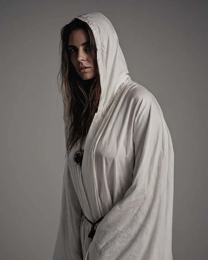
A cover is not the best photograph from a shoot. It is the frame that still reads at the size of a postage stamp, with somewhere for the words to go. Design for the thumbnail, then check it large - Almost everyone does that backwards. Start in the studio.
Thumbnail first, always
At 200 pixels a face is a smudge and a busy background is noise. What survives is silhouette and contrast.
- One clear subject, one clear shape against its ground.
- High contrast between subject and background. Mid-tone on mid-tone disappears.
- Squint at it. If the shape is unreadable, no amount of detail will save it.
Leave real room for type
Type dropped over a busy area is unreadable, and moving the subject afterwards is a re-render. Compose the gap in.
| Layout | Reserve |
|---|---|
| Title above | Upper third kept plain and darker |
| Title below | Lower third kept plain |
| Side-set title | One vertical third, subject off-centre |
| Overlay across | A broad flat area of even tone |
Finishing it
Get the composition right before spending on resolution, and never ask the model for the words themselves.
- Do not request rendered text - It comes back as gibberish letterforms every time.
- Set the crop here; widen later with the canvas expander if the layout changes.
- Enlarge once at the end with the upscaler.
Covers that pass the thumbnail test
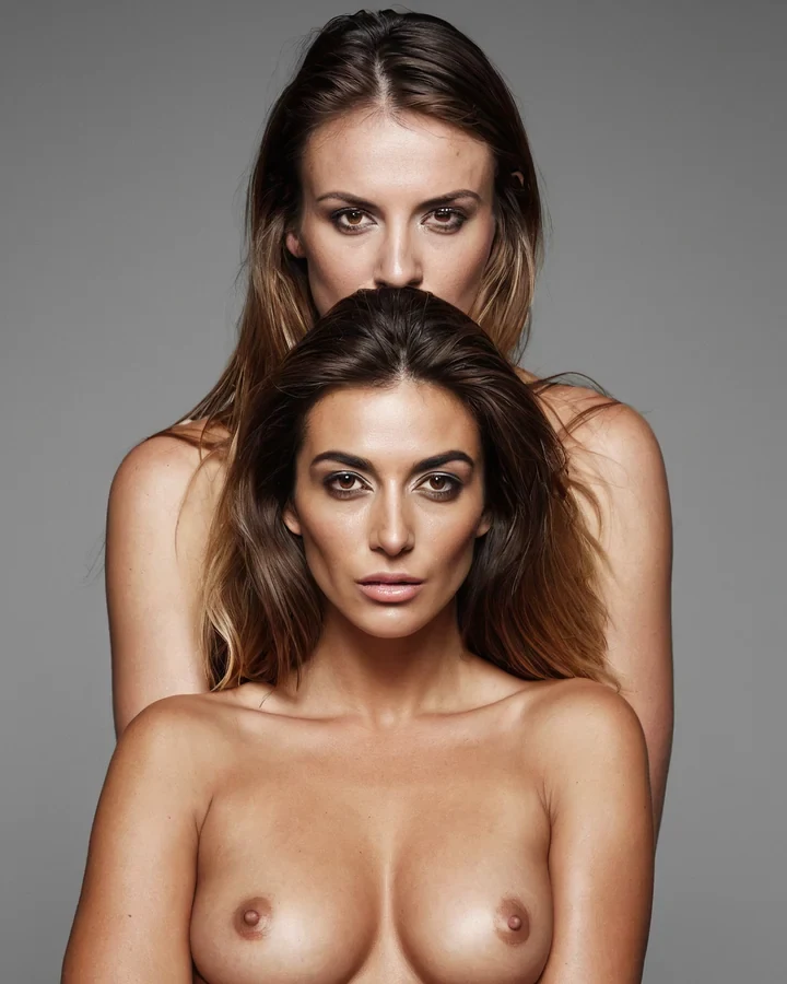
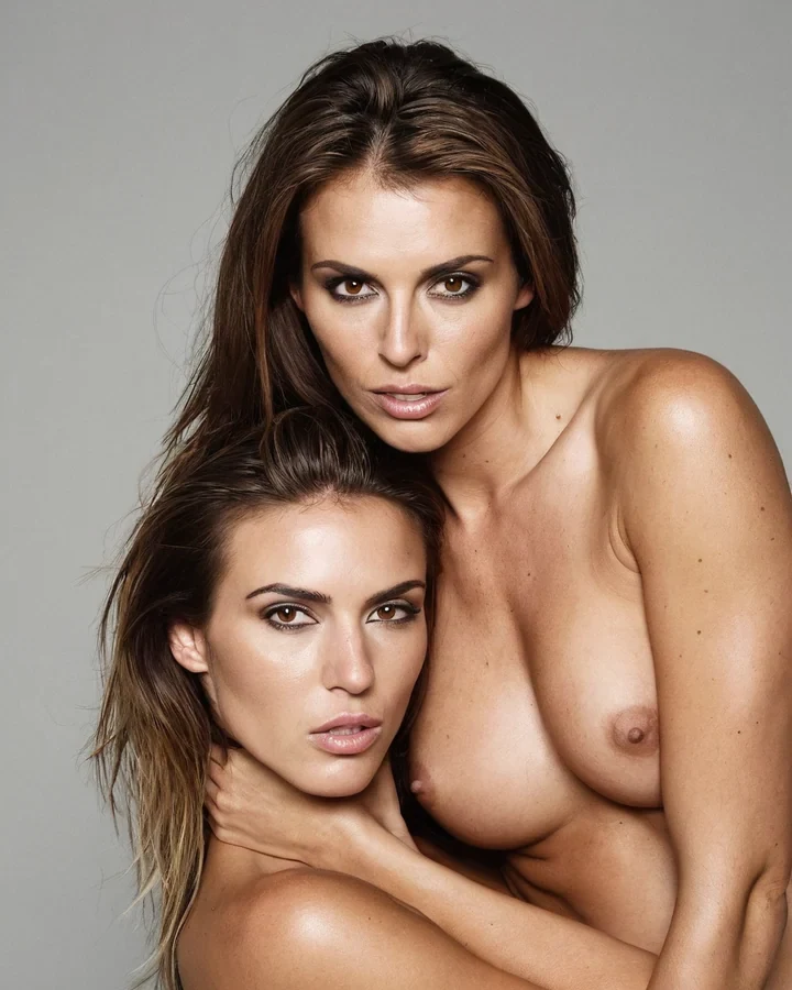
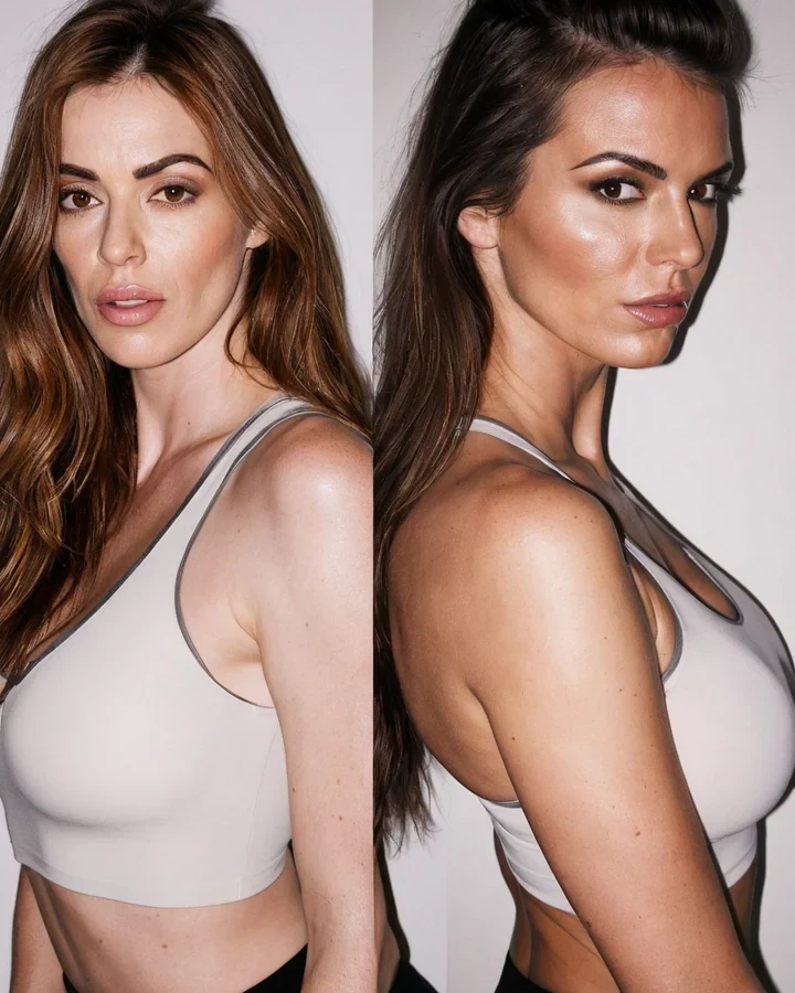
Example results in the style this tool produces, not a single verified before-and-after run.
Worked example: a series cover that survives the thumbnail test
| Composition | Portrait, 1024x1280 |
|---|---|
| Reserved space | Upper third, low detail |
| Cost | 5 credits |
| Check at | 120 px wide |
The exact instruction
single figure lower two-thirds, strong silhouette against a bright sky, high contrast, upper third kept simple and low detail for a title, no text
What comes back
Shrink the result to 120 pixels. If the figure still reads and the top third is still quiet, it works. Most covers fail this test and look fine at full size.
When it goes wrong
| What you see | Why | What to change |
|---|---|---|
| Unreadable as a thumbnail | Low contrast or too many focal points | One subject, high contrast, strong silhouette |
| Nowhere to put the title | Generated edge to edge | Reserve a quiet zone before generating |
| Title is illegible over the art | Reserved area is busy | Move type to the calmest region |
Campaign Cover Maker: common questions
Does the cover maker add the title text?
No, deliberately. Diffusion models render text as gibberish - It reserves the space and you set real type over it.
What aspect ratio should a campaign cover be?
Portrait 4:5 covers most placements. Check the specific slot first; recomposing later costs another render.
Why does my cover look weak in a list?
It was judged at full size. Shrink it to thumbnail width and look again - Weak silhouette and low contrast are almost always the cause.
Can I use a normal render as a cover?
Often not. A good photograph fills the frame; a good cover leaves a third of it deliberately empty.
Where to go next
This tool is usually used alongside build the episode, extend the artwork and glamour campaign frames.